The 60’s – Draft layout

This is just a draft, the information i just put into my own words but haven’t proof read or put the paragraphs in the right order so it might sound a little silly at the moment but it’s all the information I want to use. And the layout of the text will be a little different.

The images are not exactly where I want to place them and is not all the images I would like to use.

This is just a draft and I haven’t added headings yet. I just wanted to display how I want the text to flow in the waves and also what the image bubbles will look like.

Information panel critique submission png

The 60’s – Poster layout

So I ended up having to do the layout in Illustrator because I didn’t know how to create the wavy design in inDesign. I found a 60’s pantone and used that as inspiration for the colour scheme. The typeface I used is actually called Mojo and was designed by Jim Parkinson in the 1960’s and I think that will be the typeface I will research and document. The original sketch is the bottom image.

Information panel

IMG_5768

The 60’s – Psychedelic Movement

Beginning in the mid 1960’s the psychedelic movement had an effect on many aspects of pop culture including dress, language, art, literature and philosophy.

Psychedelic was what the youth referred to as the drugs that were popular at that time and concert posters would try and express that feeling of ‘tripping out’.

With bold bright colours, psychedelic was eye-catching. Typography became distorted and focused  on negative space, lettering was manipulated and forced to create shape.

The invention of psychedelic type seemed to capture the spirit of the time, what was once taboo was now normal. Designers embraced illegible type, fluorescent inks and vibrating colours. Typography was being stretched like never before.

A well known designer of psychedelic posters is Wes Wilson who invented a style that is now synonymous with the peace movement, psychedelic era and the 60’s with his poster for Bill Graham of The Fillmore in San Francisco. In 1966 he invented a psychedelic font which made the letters look like they were moving or melting.

wes-wilson

Another well known designer is Victor Moscoso who used the concept of vibrating colours which he achieved by taking colours from opposite ends of the colour wheel with each one having equal value and intensity.

victor-moscoso_avalon-ballroom-1966_big-brother-and-the-holding-company


Source: http://alansaccodecelis.blogspot.com.au/2014/01/psychedelia.html 

The 60’s – Typeface Research

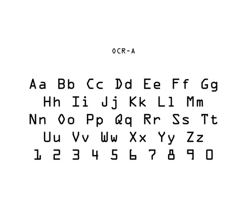
OCR-A

OCR-A font specimen

OCR-A was created in 1966 which was developed to be read by machines in a time where machines did not have the ability to differentiate between fonts. The ink was magnetically charged to ensure scanners look for the numbers but the problem was that the font was better fit for computers and some found not so appealing.

Which led to a second attempt…

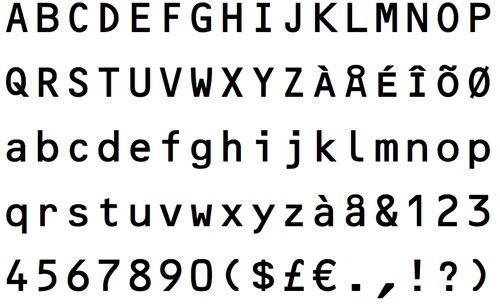
OCR-B

OCR-B type specimen

The European Computer Manufacturers’ Association felt that OCR-A was not built for humans’ sake and tasked Swiss Typographer Adrain Frutiger to fix the problem.

The result OCR-B was released in 1968 and looked closer in design to a standard European font than OCR-A’s more stylised look ever did. Frutiger noted that it was not easy, it was challenging to ensure the “8” and “B” characters were read as unique characters.

Source: http://tedium.co/2017/03/22/ocr-typography-optical-character-recognition-history/

Antique Olive

AntiqueOlive

Famous French type designer Roger Excoffon first designed the Nord and Nord italic in 1960. Compact weights in 1963, Black weight in 1965, Bold Condensed in 1968 and Roman and italic weights in 1969. Antique Olive has a very large x-height and open letterforms, therefore it is very readable and ideal for smaller point sizes.

Source: https://www.linotype.com/1309008/antique-olive-family.html 

Eurostile

Originally produced in 1962 by Italian font designer Aldo Novarese, it reflects the flavour and spirit of the 1950’s and 60’s. With big squarish and rounded corners looked a lot like the television set from that era. Eurostile works well as a headline and also in small bodies of text. It has 11 weights, from Roman to Bold and condensed to extended.

Source: https://www.linotype.com/384/eurostile-family.html

Impact

impact

Impact was designed by Geoffrey Lee in 1965 and was released by Stephenson Blake foundry of Sheffield.

Source: https://www.revolvy.com/main/index.php?s=Impact%20(typeface)

Ad Lib

AdLib

Designed by Freeman Craw for the American Type Founders in 1961, Ad Lib is a bold Grotesque with irregular rectangular counters in round characters.


The 60’s – Typographic Technology Research

I’ve been scouring the internet for 60’s typographic information that I may or may not use. At the moment I’m going to keep my options open, the only thing I’m absolutely certain about is my feature segment which will be totally psychedelic.

Here are some things I found that may be on my information panel and that I think played an important part in 60’s Typography.

Typesetting/Typographic technology

Letraset

Letraset dry rub-down instant lettering are sheets of film that rub off with the end of a pencil to create lettering and were introduced in 1961. Letraset had a wide range of typefaces, incorporating classic and contemporary type from that period in time. With each design available in a wide range of type weights and sizes. It was an affordable solution for amateur and professional designers. The Letraset technique was also applied to a children’s game called Action Transfers in 1964. Action Transfers were figures of people, animals, vehicles, weapons, explosions and so on, which were applied to a cardboard background using the end of a pencil.

Letraset-boegen

Source: http://www.bbc.com/news/blogs-magazine-monitor-24107202 https://en.wikipedia.org/wiki/Letraset                    https://en.wikipedia.org/wiki/Action_Transfers

ICOGRADA

ICOGRADA stands for International Council of Graphic Design Associations and is now known as ico-D which stands for the International Council Of Design, was founded in 1963 by Peter Kneebone and Willy de Majo in London. ICOGRADA was created to promoted the role of graphic design in society and commerce and was made up of voluntary groups of 70 independent associations from 45 countries. ICOGRADA seeks to raise the standards of design, professional practice, ethics and raise the professional status of the graphic designer. It contributes to the theory, practice and research of design education.

Source: http://www.ico-d.org/about/history#legacy    https://archiveshub.jisc.ac.uk/search/archives/f978edf6-d638-32c3-9172-1a2f06543696

IBM Selectric Typewriter

Launching in 1961, the Selectric typewriter was an overnight hit.  A golf-ball-shaped type head replaced the conventional typewriter’s basket of type bars which eliminated pain of rapid typing and jammed type bars. The golf-ball type head was interchangeable which enabled the quick change to different fonts. The Selectric Typewriter paved the way for the use of typewriter keyboards as the primary method for people to interact with computers.

Black and white of the selectric typewriterRelated image

Source: http://www-03.ibm.com/ibm/history/ibm100/us/en/icons/selectric/

Phototypesetting

Phototypesetting is the process of  printing text via photographic methods onto photosensitive paper. In the early 1960’s the Cathode Ray Tube Machines were the next improvement in typesetting methods. Similar to a television picture tube, an image of each character was created on a screen of a cathode ray tube (or CRT) which was then projected through a lens where it would form a character of the appropriate size on light-sensitive paper or film.

Oscilloscopic_tube

Source: http://www.dsource.in/course/digital-typography-1/phototypesetting  http://www.historyreference.org/library/reftype.html


The 60’s – 20th century type planning

Super excited for this assignment! The feature segment of my information panel will be psychedelia and I also want to take inspiration from that and put it into the layout.

I’ve sketched out a few layouts:

The first and second sketch would have to be my favourite, I think the layout is interesting. I want to add as many images as I can, the 60’s was very colourful and I want to portray that.

DSC_0305DSC_0309DSC_0306DSC_0307DSC_0308

Typography week 3 Change in direction Inspiration

So I have definitely what direction I want my final piece to go.

I want to incorporate a building or bridge to signify concrete and then place the word proven into the photo through photoshop.

Here are some images I came across while researching and finding inspiration.

Roof being held up by concrete- Proven in the form of reliability and time tested

A concrete bridge- Proven in the form of reliability and time tested


Concrete pavement- Proven in the form of sustained and time tested


Concrete bricks/wall- Proven in the form of Rock solid, reliable and time tested


Concrete railway line- Proven in the form of reliability and time tested

Metro_Trains_Melbourne_Comeng

Typography week 3 Change in direction

I’ve totally changed the direction that I want to go in. I gathered inspiration of my Dad, he was talking about buildings and bridges.

I compiled a few sketches which I think relate to Proven and Concrete.

Reliable and time tested

fullsizeoutput_146c

A concrete pillar holding up a roof, proven strength and that it will last over time. The word proven would be on the roof top.

fullsizeoutput_146f

A bridge being held up by concrete.

fullsizeoutput_146d

The side walk with the words proven carved into it and a paw print. This is time tested.

fullsizeoutput_1470

A brick wall which is proven strength.

fullsizeoutput_1471

Train tracks

fullsizeoutput_146e

I would like to use this font

Blog at WordPress.com.

Up ↑